WealthFront - Guide Customisation with top notch look and feel
Homepage
Sexy header
The header has link to direct user to different areas of the website. The look and feel matches the one present in the main website with the aim to create a seamless user experience. We had to recreate the HTML/CSS from scratch in Zendesk.
Wealthfront logo takes user to main website.
The login feature logs the user in both instances of the website - the Guide and the main website. There is and SSO (Single Sign On) feature for this enabled. The Zendesk SSO documentation can be found here.
The website has also host mapping so the URL of the help center started from wealthfront.zendesk.com/hc/en-us and ended up being https://support.wealthfront.com/hc/en-us
The host mapping documentation can be read here.
The most interesting feature here is the “Most common questions”. This has a very sleek custom development. We wrote a script that pulls data from Google Analytics - which is available inside Zendesk - and we are able to see the most clicked through articles in the guide help center and dynamically populate them below the search bar. Pretty cool, right?
categories and useful reads
Beautiful categories with recognisable icon navigation.
The useful reads are articles with titles and a little bit of their body displaying. By adding labels to the articles, a script knows to look for that label and display those articles in the homepage with the help of the API. That’s very easy to manage for the content management support team.
The video library
We created a video library in a section where users can find all videos related to getting to know the product and product updates.
We hard coded a slider with 3 of the most important videos related to the platform.
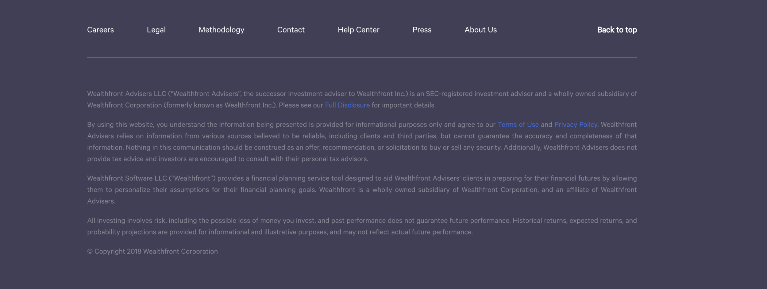
The footer
The footer looks exactly like the one in the main website. Tim would be proud. Reason I’m mentioning him is because this is one of his businesses. And I would like to get to know him haha.
Category page
Left handed navigation that uses the API to pull in the article index and display it for the user. You will notice the page does not refresh, meaning that the Knowledge base is parsed and it no longer needs to refresh in order to pull in more data.
Article page
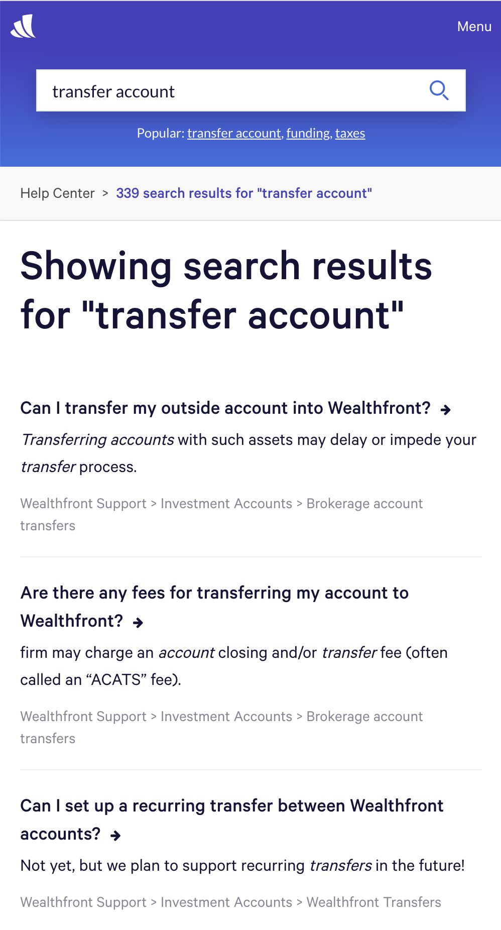
The coolest feature in the article page for me is the popular searches. Those 3 keywords that you see above “transfer account“, “funding“, “taxes” are the 3 most searched for keywords in the Help Center. They are dynamically populated by our script that is synced with Google Analytics which tracks the most popular keywords in the support desk.
Another cool feature is the popup you see on the bottom right, “Plan and invest in your future“ which is hard coded
Submit request page
Search results page
A cool feature we added here is for the user to be able to see the articles they have navigated through.


